Fidelity
Fidelity Mobile App 4.0
As the app grew to contain more features in version 3.0, we re-evaluated how it would all fit together intuitively. This redesign, along with other major feature additions, resulted in a major improvement in app store rating and garnered accolades from industry publications.
- Role
- Lead Designer
- Platforms
- iOS
- Android
- Year
- Late 2020




Background
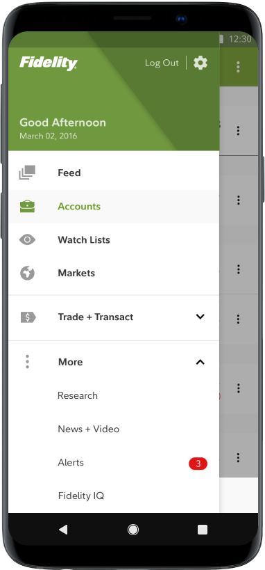
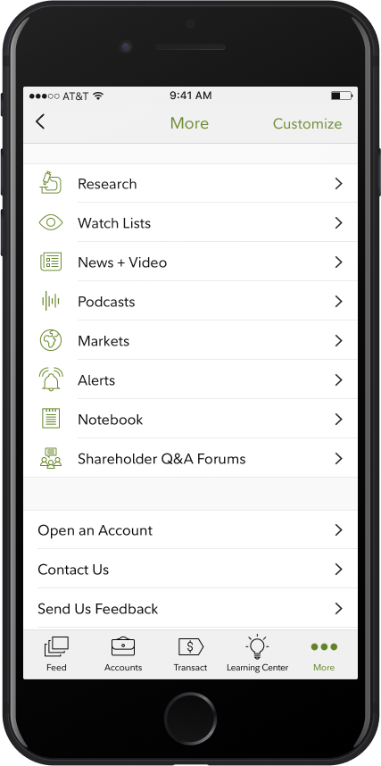
Version 3.0 relied on a “More” section for extra features.
This previous design from 2015 made sense for how few features there were in the app at the time, and aligned explicitly to iOS and Android guidance of that time.
The Problem
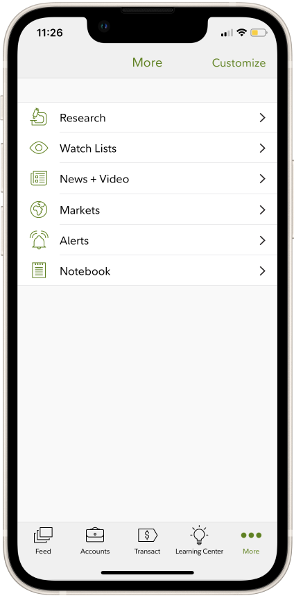
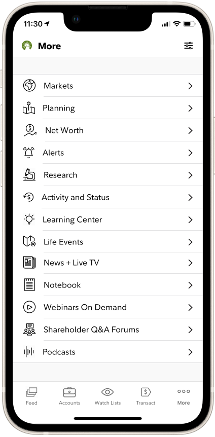
Over the years, features added to “More” made the app difficult to navigate.
Integrating new features into existing spaces, where they might fit more logically, required a lot of extra effort, as many of those spaces were built with old code and would need a refresh and collaboration with several other product owners and teams. This meant the fastest and easiest way to get a new feature in the app was simply to create a new space.
201710 tabs
201812 tabs
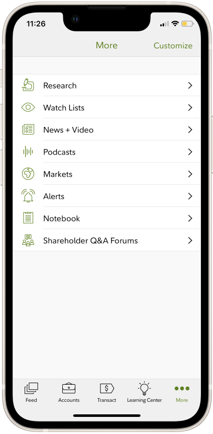
201916 tabs
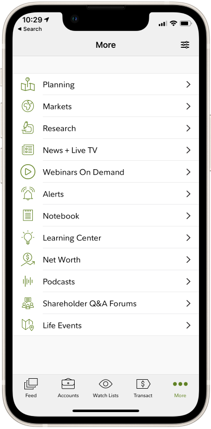
202017 tabs
The Process
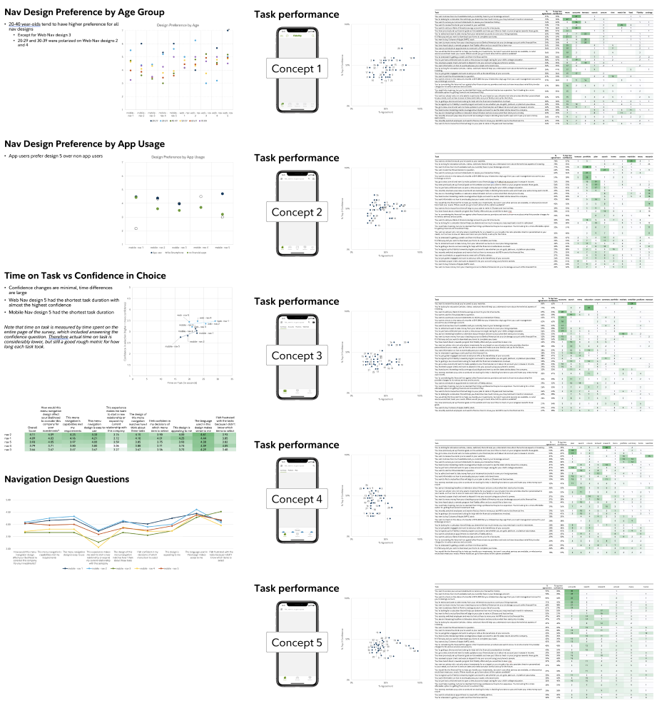
Several rounds of concept testing showed that simple is best, and that what customers prefer is not always what performs the best, but no optimal solution emerged.
We tested concepts for how long it took to find each feature and how confident the user was that they were right. We looked at preference along several axes.
The Process
With no clear direction coming from research, we reversed the process, creating something simple and familiar, and seeing if it fits.
Our previous attempts to render the ideal nav model based on user-testing and usage-rates always seemed to favor one type of customer over another. Counter to our usual process, we generated a concept for an app nav that was as simple and familiar-looking as we could fathom, and then roughly mapped our feature set to it.

The Solution
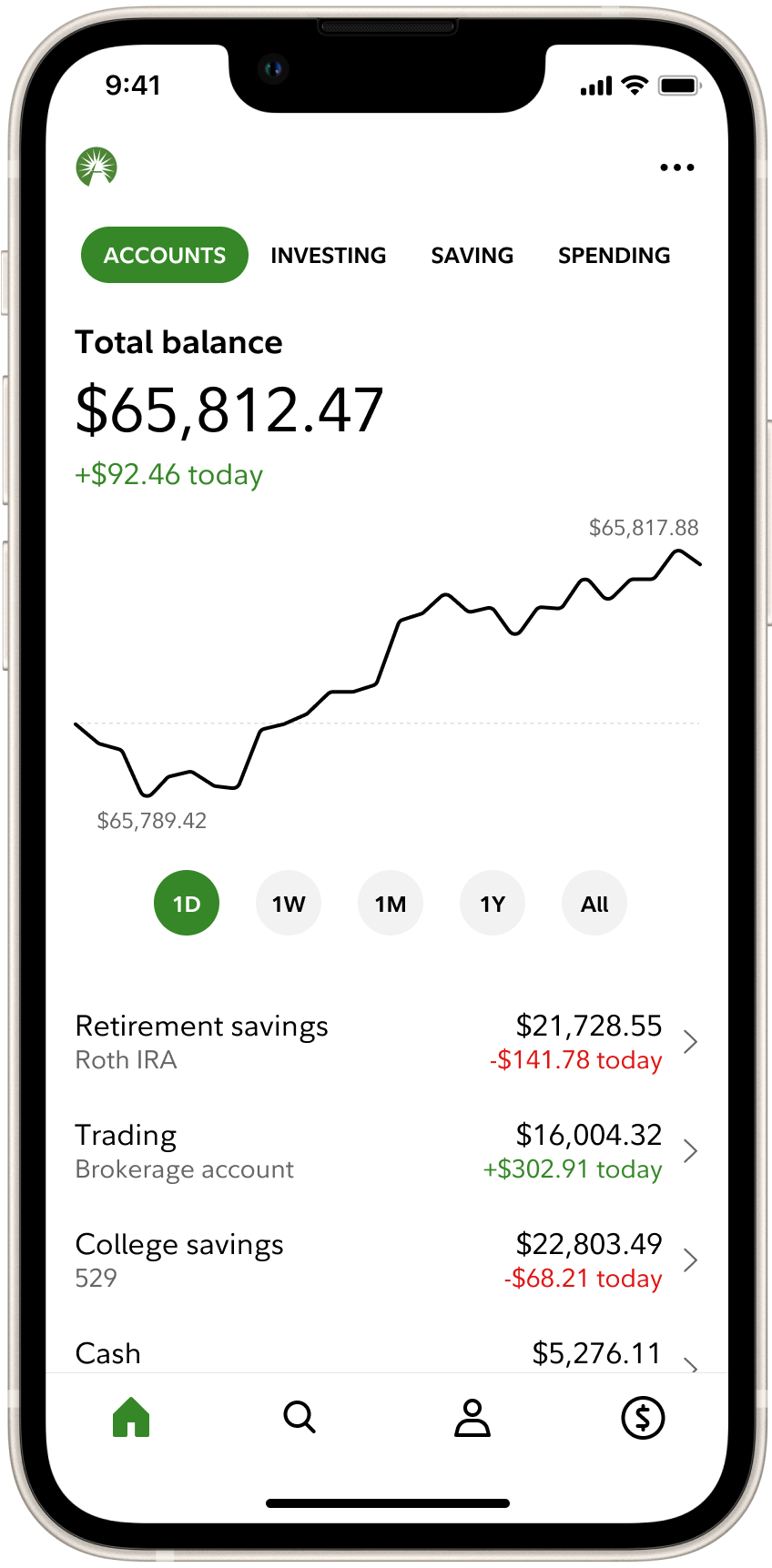
Home, Search, Profile, Transact.
We settled on a set of four tabs that were so ubiquitous, they arguably don’t even need labels. Virtually all features would be accessible through more than one tab, so we could accommodate various customer mental-models.
The four tabs:
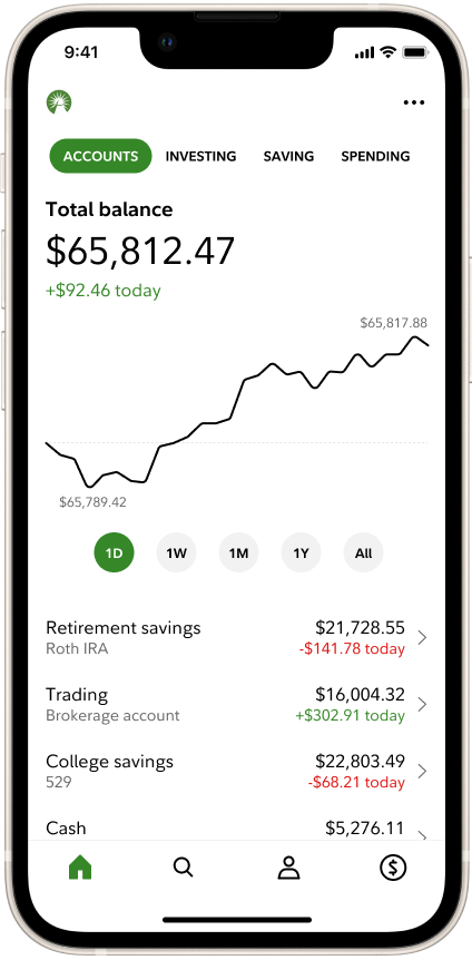
Home
Monitor your money.
In addition to viewing their accounts, Home displays their finances through three lenses that align to Fidelity’s retail offering: Saving, Spending, and Investing.
Search
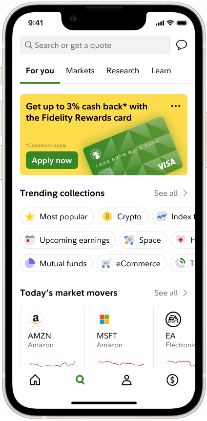
Discover financial insights and find whatever you’re looking for.
Search is primarily where customers can seek out exactly what they’re looking for, whether that’s a hard-to-find feature or a stock quote. Search also contains several explorable sections that customers can use to stay up-to-date and learn about financial topics.
Profile
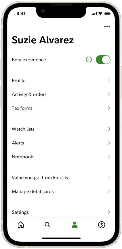
Maintain your personal information and settings.
Profile is modeled after other popular apps. Besides personal info, customers often look here for things like settings and security. We continue to experiment with what else customers might associate with this space, trying things like Watch Lists and Notebook.
Transact
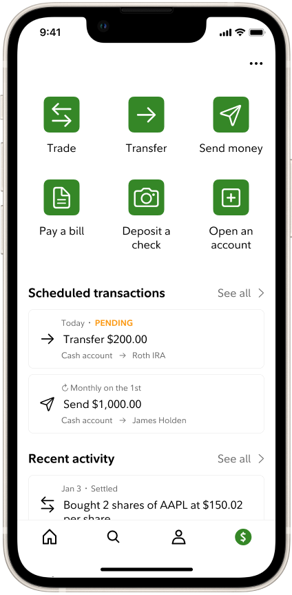
Take action with your money.
Being such a heavily-used space, Transact remained functionally the same as before. Previous experiments that changed it tended to frustrate customers.