Fidelity
Fidelity's Design System
Standardizing visual styles, components, and patterns across Fidelity’s interfaces by providing design tools and coded assets.
- Roles
- Lead Designer
- Creative Director
- Platforms
- iOS, Android, & Web
- Year
- 2020 – 2023
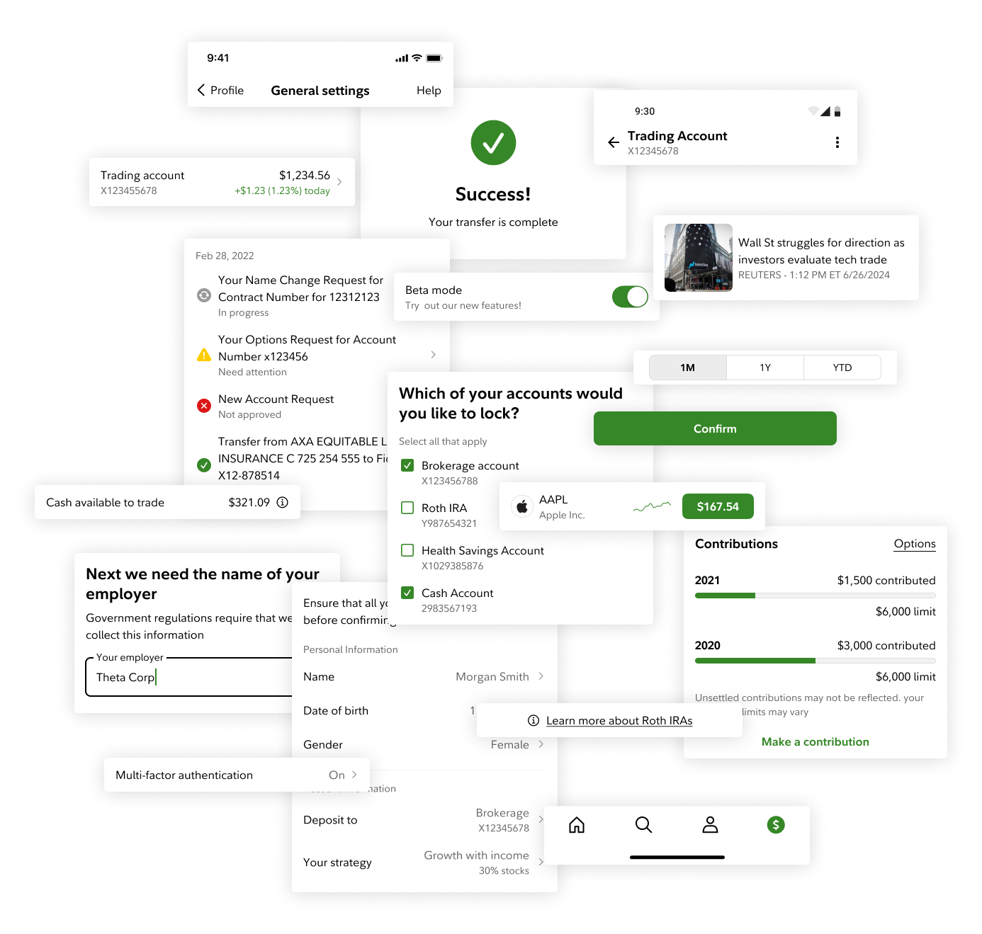
As the firm invested more and more into enhancing Fidelity’s iOS and Android apps through 2020, three problems emerged:
Problem #1
Our interfaces were becoming increasingly visually inconsistent.
Problem #2
It was taking a long time to get new features to market.
Problem #3
Making retroactive updates to visual styles required a lot of work.
Solution
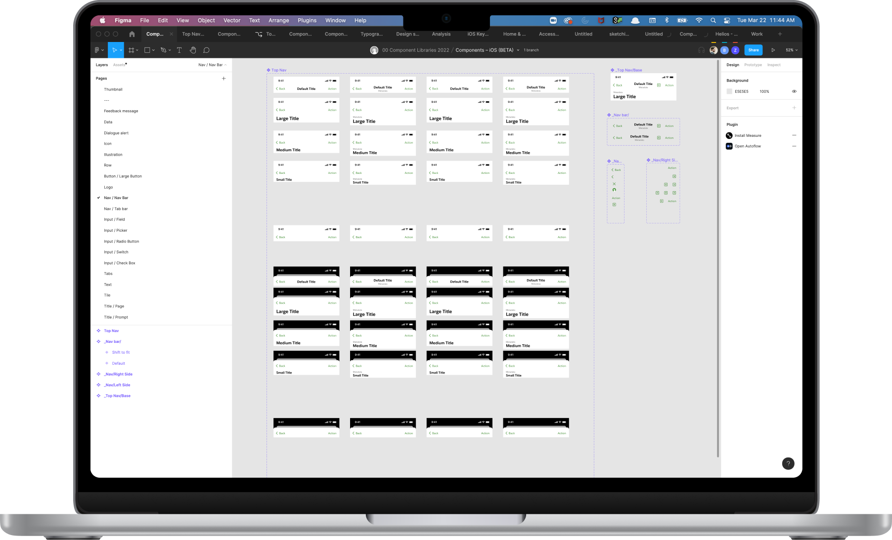
I created a component library in Figma that aligned with matching coded components.
I collaborated with dedicated iOS and Android developers to establish a set of functional requirements for each component, which I referenced as I built out each component in Figma. The team relied heavily on what came out-of-the-box from iOS and Android, taking care to only override where absolutely necessary.
Feature #1
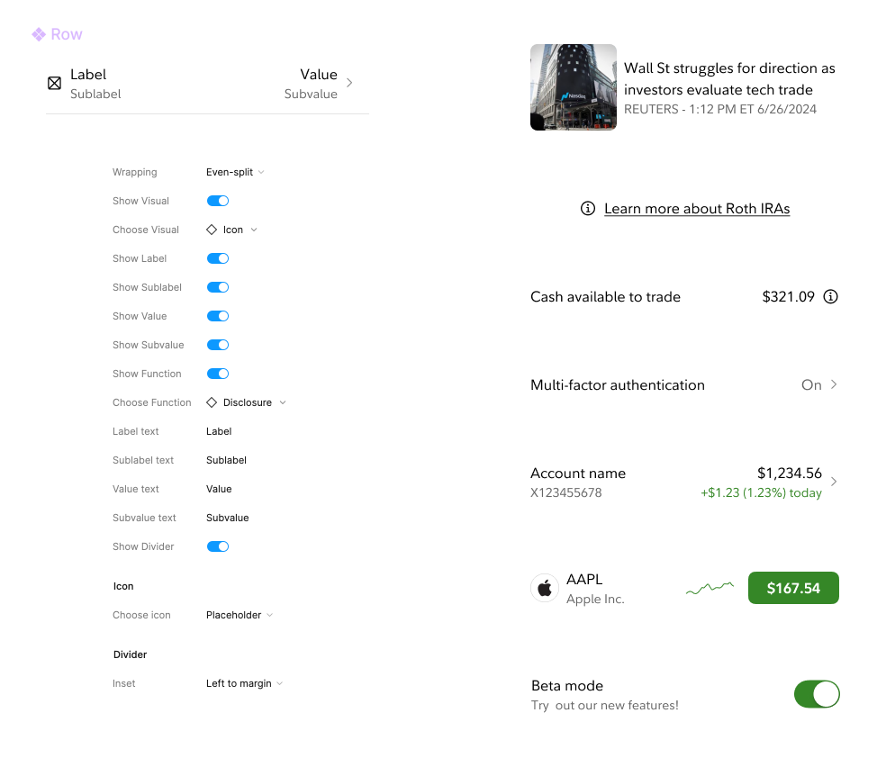
Rich components
Components like the “Row” can be configured to fit a myriad of different needs through the component settings panel.
Feature #2
Ease of use
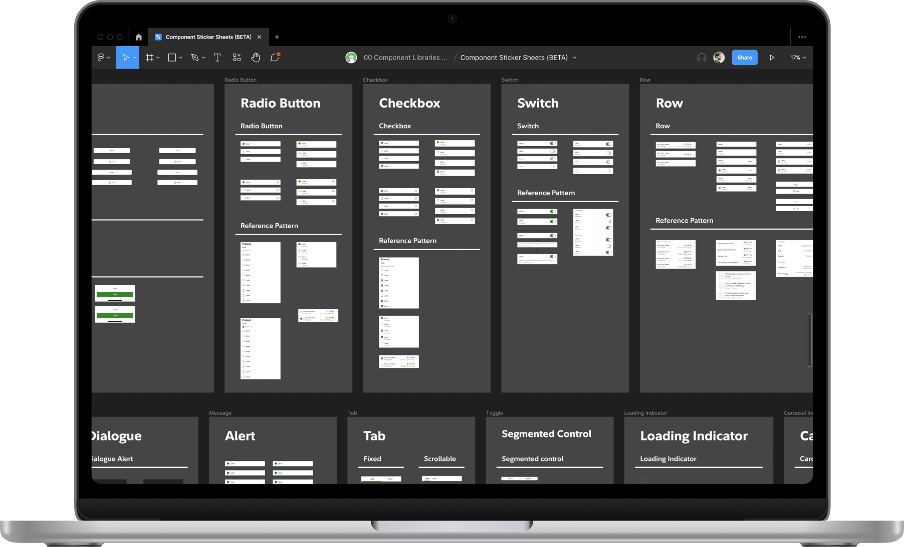
Designers struggled to use Figma’s built-in Assets panel, so I created a shared file, dubbed the “Sticker sheet,” from which everyone could copy and paste components into their working files. Over time, this also became a collaborative space and shared pattern library.
Feature #3
Robust tokens
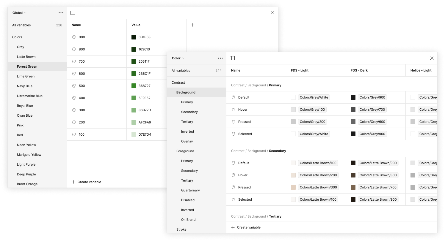
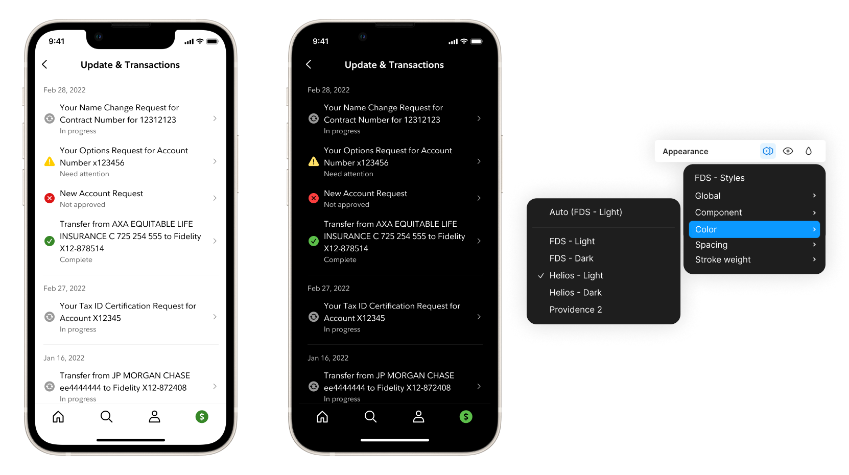
The team and I built a multi-tiered system of global, alias, and component tokens using Figma’s variables feature, and applied them to the components. This makes scaling and updating easy, lets us swap between light and dark modes, and enables the use of…
Feature #4
Themes
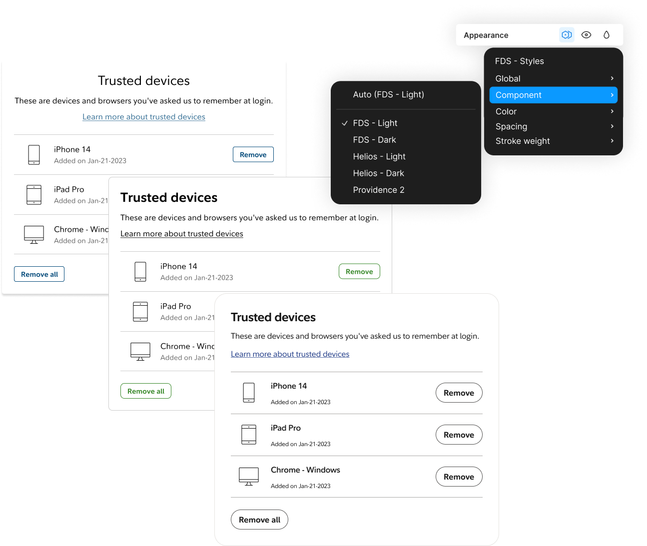
As the organization aligns to a single design system, newly built features must occasionally be able to integrate with an existing page or journey that still uses an old or different system. Using thoughtfully-applied design tokens, we can create themes that approximate these other design systems.
(This is still a work-in-progress)
Communication
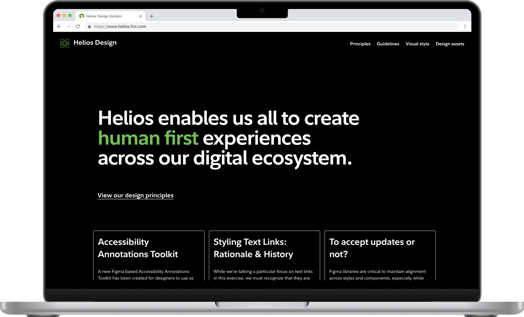
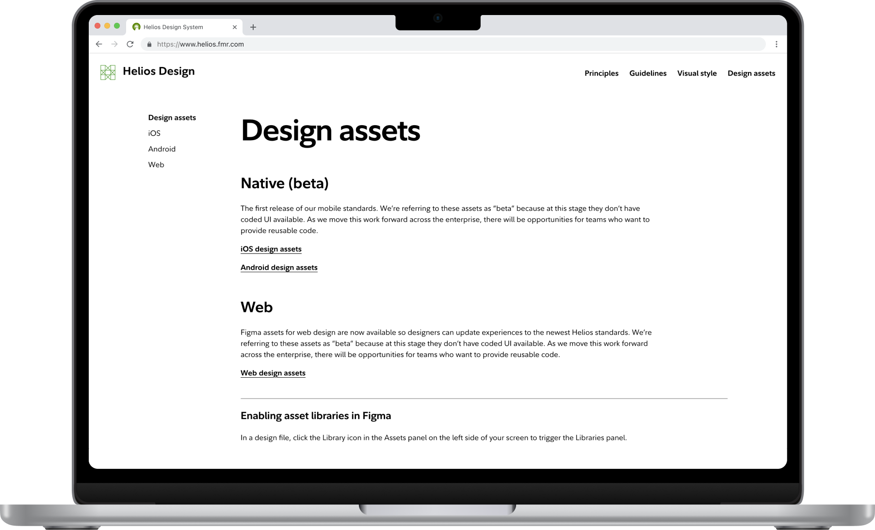
We published an internal site to share updates and guidance with other designers and the rest of the firm.
The site includes onboarding walk-throughs for designers new to the system, links to important resources, files, and libraries, blog posts addressing topical issues, and a growing repository of guidance and best-practices for patterns and components.