Fidelity
Accounts
With major changes to the app’s navigation and visual styles, we redesigned and enhanced the way users interact with their accounts to align.
- Roles
- Lead Designer
- Creative Director
- Platforms
- iOS
- Android
- Year
- Early 2021
Looking at all accounts
We combined the account list and the combined details of all accounts into a single view
Much of the granular detail that would live on the All Accounts detail view moved to the Investing, Planning, and Spending sections. This meant we could also significantly simplify this space. The result makes for a much cleaner and clearer first-look at the app.
Before
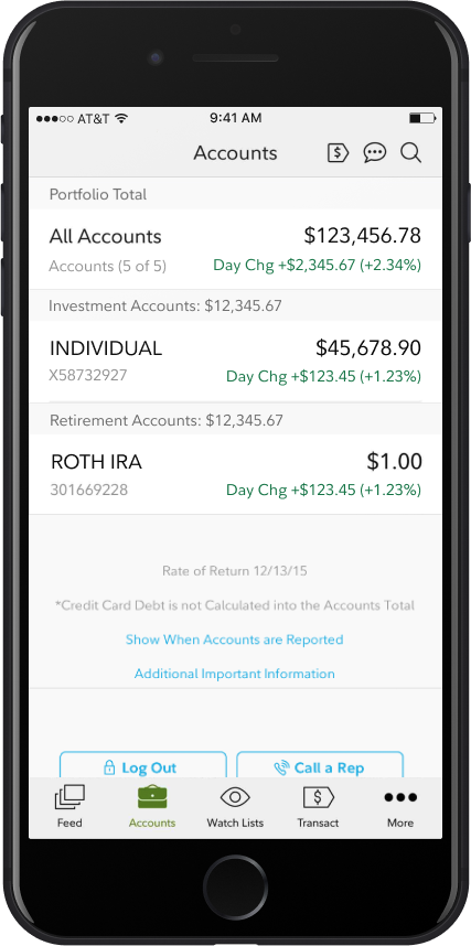
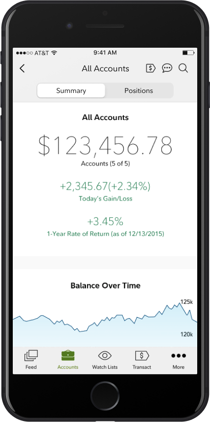
Originally, customers would have to tap the Accounts tab and then tap “All Accounts” to see their total balance over time.
After
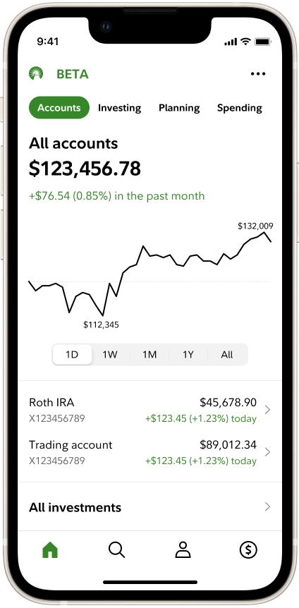
The new design merges all this together, elevating the customer’s total balance and balance over time to the fore, leaving enough room for the beginning of the account list to show above the fold.
Specific account views
Visual changes largely focused on improving accessibility and aligning layouts to more standard and familiar compositions.
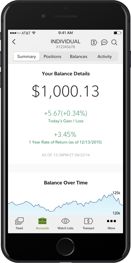
The original design makes heavy use of our font’s light weight, uses very small type sizes, and frequently uses light text on light colored backgrounds, running afoul of our accessibility standards. Much of it is also center-aligned, making it a bit harder to read and a bit less clean. The new version aligns fully to accessibility standards and embraces a more left-aligned format, which feels much more organized.
Before
Previously, an account detail view would have a set of tabs across the top to let customers navigate to their investments (positions), balances, and activity.
After
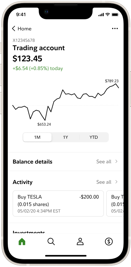
The new design does away with these tabs, and instead places links to these spaces throughout the view. This makes it a little harder to get to those spaces, but the trade-off is that those spaces no longer need to maintain that tab set and can now have their own section-level functions.
Before
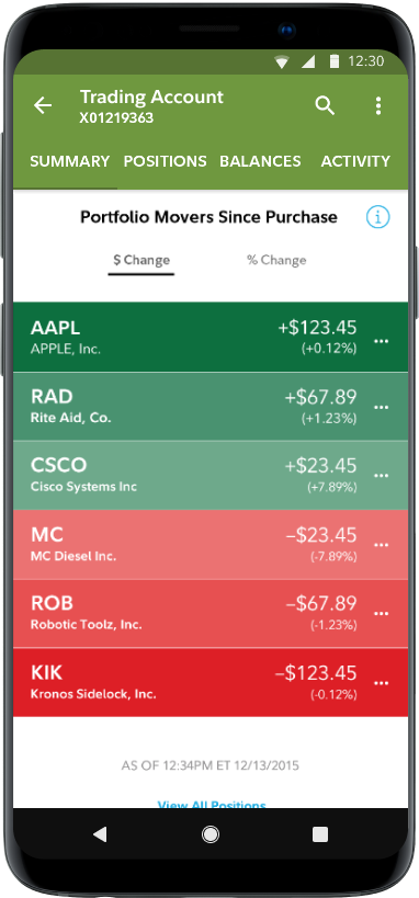
The old investments snapshot makes awkward use of color and contains some unusual interaction patterns.
After
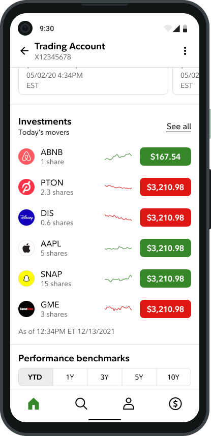
The new version aligns to the much bolder and richer presentation of investments in the “Investing” section.
Before
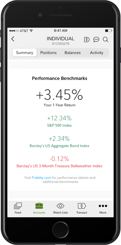
The original Performance section was completely center-aligned, making it a bit less easy to compare the customer’s own performance to that of each index.
After
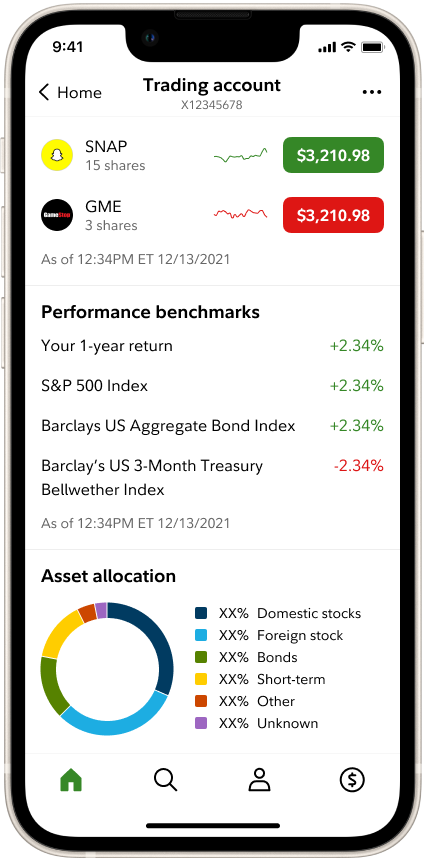
Aligning labels to the left and numbers to the right means decimal places line up and numbers appear closer together, making for quicker and easier comparison.
Before
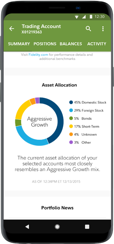
The original Asset Allocation design uses very small type and light weights, and the chart colors did not align to the latest contrast and color standards.
After
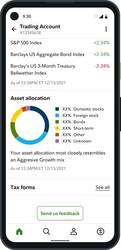
The new version tightens up the layout and removes the unnecessary strategy label from the chart, which would ruin the layout when certain accessibility features were turned on.
New features
In addition to some general clean-up and optimizations, we also introduced a few new features.
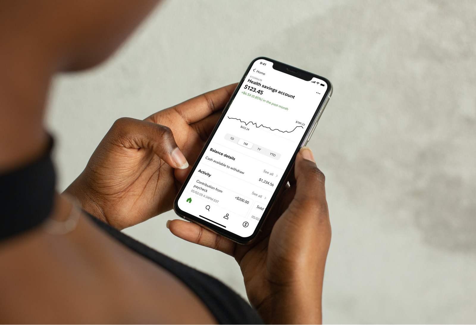
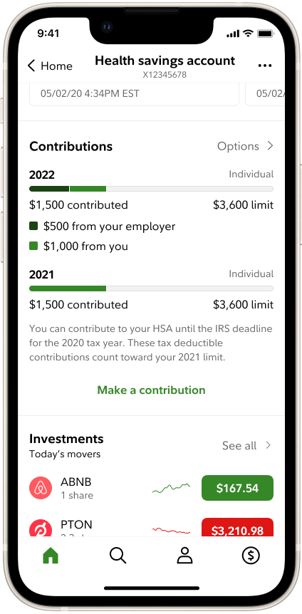
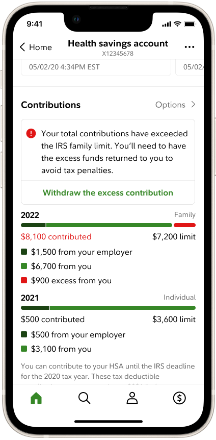
Track contributions to HSAs and IRAs
Giving customers the ability to easily track their contributions to tax-advantaged accounts led to an overall increase in contributions, a key progress indicator.
Account settings & options
Embracing common interface patterns, we introduced a utility menu on the top right of each account view, where we could tuck away important functions that customers rely on only infrequently.
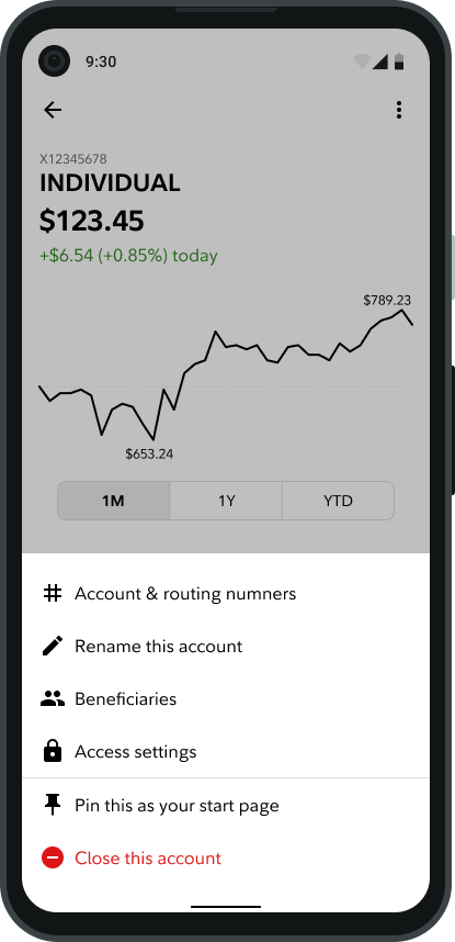
“Pin this as your start page”
We serve such a vastly diverse array of customers, each with such specific and unique needs, so we introduced this feature to let them set any account as their landing page in the app. This feature is also available on the Investing, Planning, and Saving sections in Home.
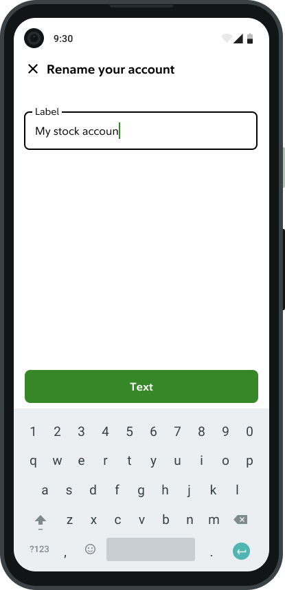
Rename your account
It always bothered me that customers would open a “Brokerage” account and it would appear with the name “INDIVIDUAL” in their account list afterwards. While the real problem goes much deeper, I was able to offer a minor fix by introducing the ability to rename accounts directly within the app. It’s a small win, but one that means a lot to me.