Fidelity
An App for Active Investors
Responding to an influx of new users to the Fidelity mobile app, I acted as the Creative Director and contributing designer for a redesign of key features that support the needs of frequent traders.
- Roles
- Designer
- Creative Director
- Platforms
- iOS
- Android
- Year
- Early 2020
The Opportunity
Dissatisfaction with a key competitor brought a massive influx of new users with unique needs
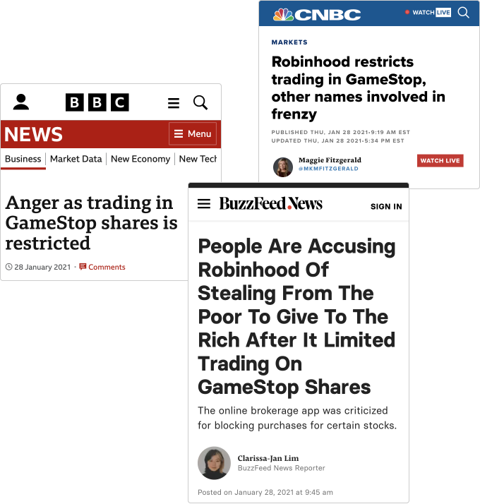
After other companies restricted trading of meme stocks, hundreds of thousands of people downloaded the Fidelity mobile app.
These new users were much more focused on actively investing and were quickly frustrated by the Fidelity app’s trading and investing features. User interviews and feedback through Reddit and Twitter quickly highlighted the main problems getting in their way:
Problem #1
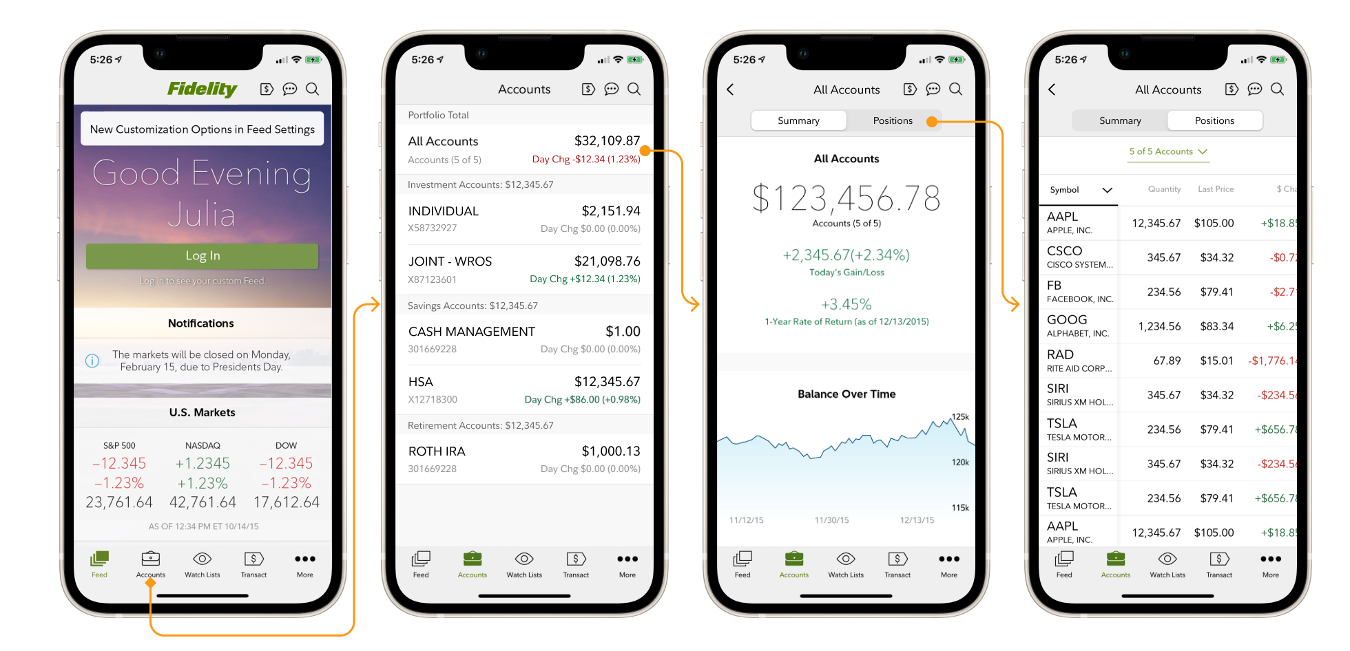
Too many taps to see the most important information
Active traders frequently opening the app to check their investment performance were frustrated that it takes three taps to see their portfolio.
Problem #2
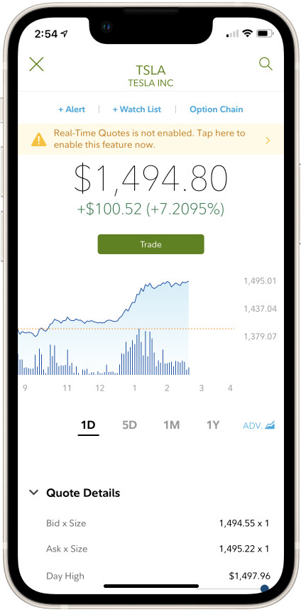
Dated visuals
These new users, accustomed to much more modern apps, felt the Fidelity app’s visual design was clunky, outdated, and unfamiliar.
Problem #3
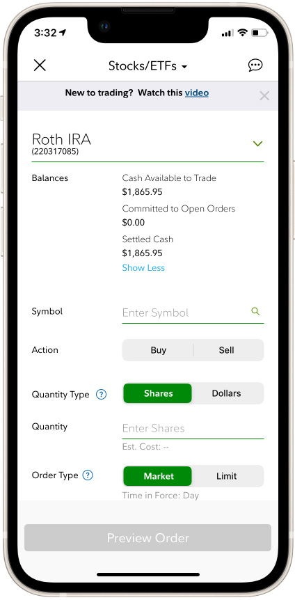
Trading is confusing and difficult
The existing trade flow placed all inputs on a single view, wherein selections made above could change options below.
Our research led us to these solutions:
Solution #1
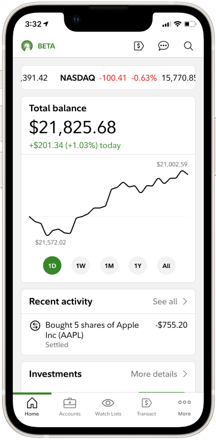
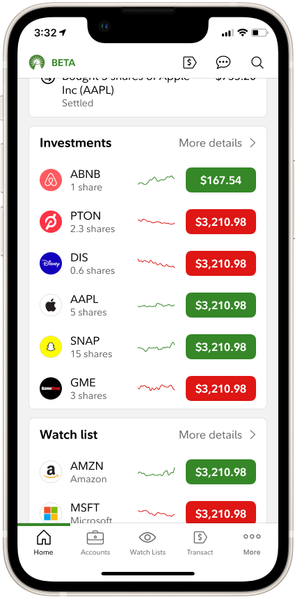
Put the information users want to see up-front
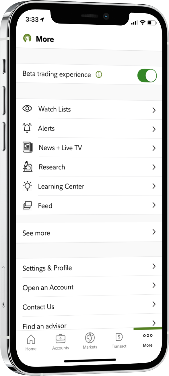
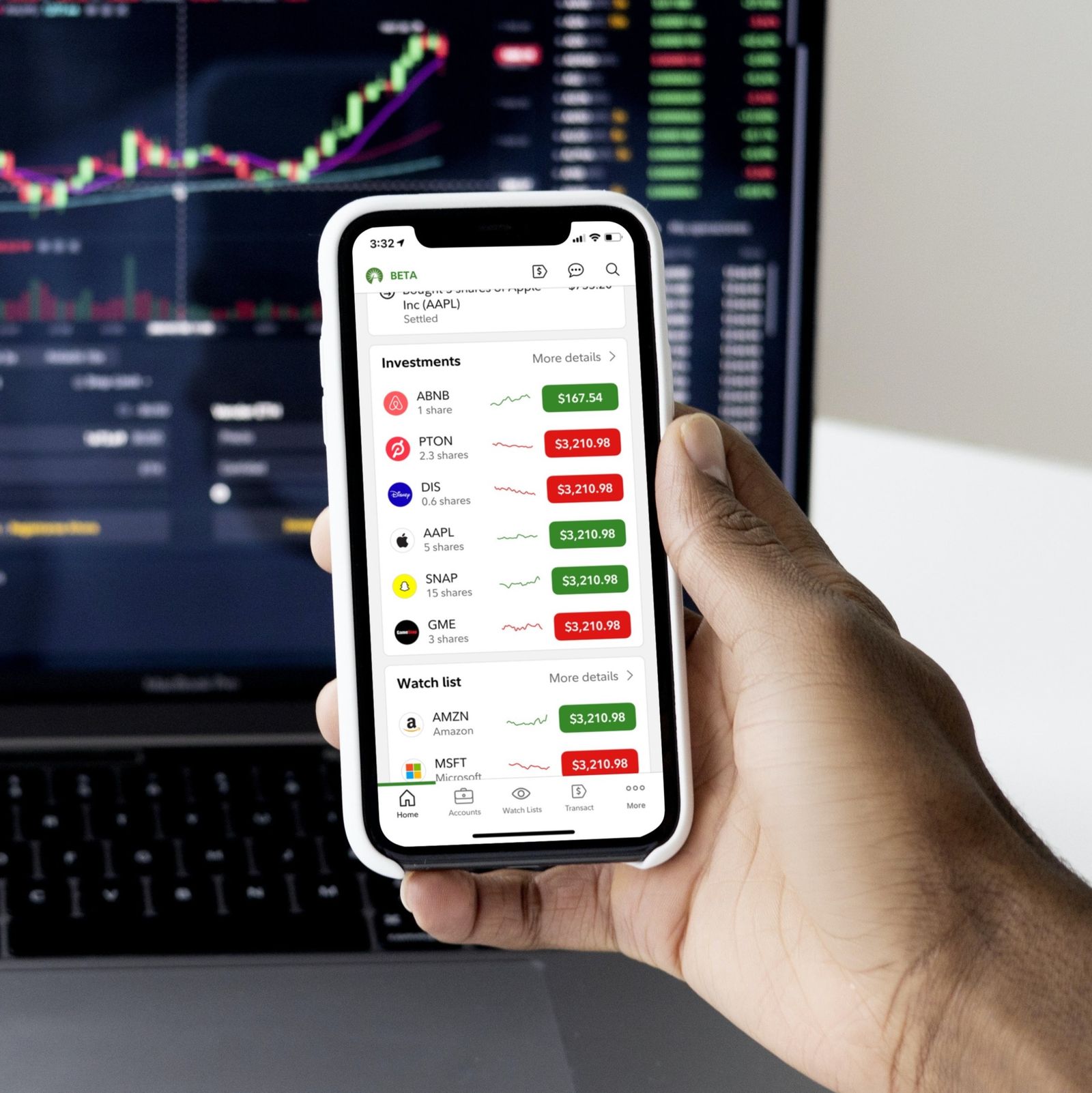
Studying usage patterns revealed that the “Feed” was not serving our users’ needs, so we decommissioned it and replaced it with a new “Home” tab that contained the information these users monitored the most frequently.
Solution #2
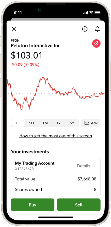
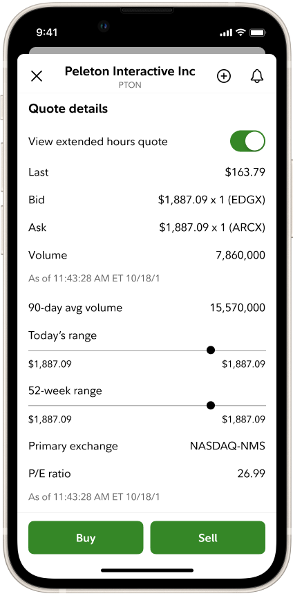
Fresh Quote visuals
With the correct information already present, we aligned the quote’s visuals to more up-to-date native mobile standards and made it accessible.
Solution #3
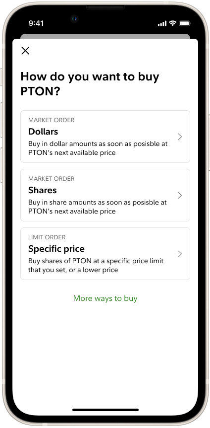
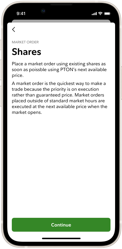
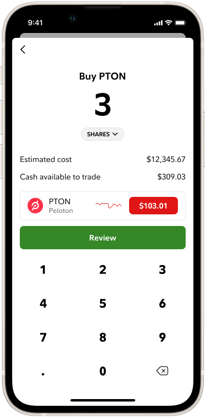
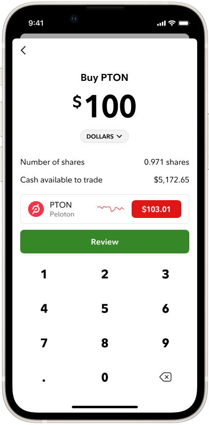
Overhaul the Trade transaction
We re-architected the trade flow, streamlining a single-screen transaction into a branching flow, which reduced the number of taps to complete a trade and created more space to complete each step. This also allowed us to include detailed explanations of key terms, improving the experience for novice traders.
Release & Reception
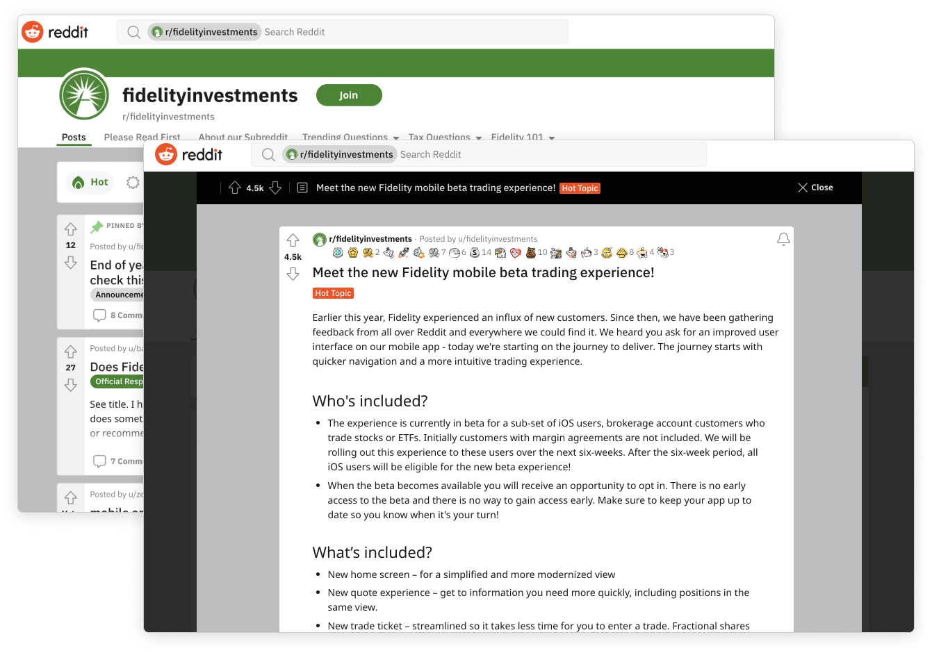
Reddit announcement
It was online discourse on Reddit that led most of these new users to join Fidelity, so it was only appropriate that we announce the release of our updates there too. The community received the updates with praise and appreciation.
We relied on feedback and discussion in our sub-reddit to prioritize what to build and improve through every iteration.
Validation
Launching, learning, and iterating in Beta
These design changes represent the first several iterations launched through a semi-open Beta app, which allowed us to more freely experiment, measure, and gather feedback.